

Have you ever been browsing a website and wonder... how did they do that? This is one of the things that are asked a lot in the WPStudio membership. This past week one of our members was on a British news site and asked if the section displayed in the image below could be done in CSS?
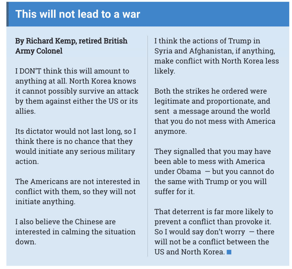
There are three CSS properties that allow developer to take a straight block of code and allow it to display like the above image.
- column-count - this property specifies the number of columns an element should be divided into. By setting this property with a number, CSS will auto-divide the element (unless additional properties like column-width are declared).
- column-gap - this property specifies the gap (spacing) between the columns.
- column-rule - this property can set the width, style, and color of the rule (line) that appears between the columns (in the gap).
- width - Options include: medium, thin, thick, and length (pixel width etc)
- style - Options include: none, hidden, dotted, dashed, solid, double, groove, ridge, inset, outset.
- color - Options include any CSS color value.
Now let us look at a piece of example CSS that would be applied to the "content" area to make any wrapped code layout like the above screenshot image.
.content {
  background-color: #00ffff;
  padding: 15px;
  column-count: 2;
  column-gap: 50px;
  column-rule-style: solid;
  column-rule-width: 1px;
}
Yes, it is as simple as that. But if you really want to utilize these CSS columns in your site's content it is important to also consider the responsive requirements for mobile devices. If you were to leave these column-count declarations the display of the content area would have multiple columns on your mobile device making the content difficult to read. You can use media queries to adjust the column-count to make the content's readability much better.
@media screen and (max-width:480px){
  .content {
    column-count: 1;
  }
}
By setting the column-count property to 1 the other column properties are no longer necessary since no gaps exist. The content that displayed in columns for regular browsers now will show as a single column on a mobile device. Remember that the same concept can be applied to media-queries that target extremely large screens as you can add even more columns.
How do you use CSS column properties? And if you want to read more about different CSS properties and different ways to use them in layout design, let me know in the comments below.
UPDATE - Since I was asked about additional examples, I thought I would just drop this CodePen here and let you all play with the example I used over the weekend for WPStudio members.
See the Pen CSS Columns - WPStudio Example by Benjamin Bradley (@wpstudio) on CodePen.